In the digital age, the difference between a product that is “used” and a product that is “loved” often comes down to the subtle nuances of its design. I believe that UX/UI is no longer just about making things look pretty; it is about orchestrating a seamless dance between human psychology and technological capability.
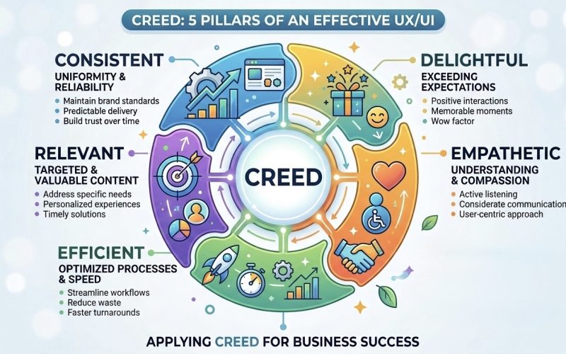
While these concepts may exist scatteredly across the design world, I have synthesized them into a singular, unified framework: CREED (Consistent, Relevant, Efficient, Empathetic and Delightful). When these five pillars support a product, the technology disappears, leaving only a fluid connection between the user and their goals.
1. Consistent: The Language of Trust
Consistency is the foundation of usability. It is the silent promise that a product makes to its user: “If you learn how to do this once, you will know how to do it everywhere.”
When UI elements like buttons and icons follow a predictable pattern, users develop mental models. I aim to reduce “cognitive load”—the mental effort required to process information—by ensuring that once a user understands a gesture or a symbol, that knowledge remains valid throughout the entire journey.
Real-World Example: Airbnb
Airbnb is a masterclass in visual and functional consistency. Whether I am browsing on a phone or a desktop, the search bar and the “Reserve” button remain identical in behavior and placement. This consistency builds brand trust. If a button changed color or shape from one page to the next, it would create subconscious friction for the user.
2. Relevant: The Power of Context
A RELEVANT UI shows the right information to the right person at the right time. In an era of information overload, I see relevance as a filter that highlights what matters and hides what doesn’t.
Relevance is driven by data and contextual design. I argue that an interface that looks the same for a first-time user and a power user is failing both. The UI must adapt based on where the user is and what they are trying to achieve in that specific moment.
Real-World Example: Spotify
Spotify’s “Made For You” sections are the gold standard for relevance. The UI adapts based on listening habits. Instead of a static storefront, the interface dynamically reconfigures itself. I find this makes the product feel like it was designed specifically for the individual, which significantly increases retention.
3. Efficient: The Path of Least Resistance
Efficiency in UX/UI is about minimizing the distance between a user’s intent and their result. I believe a truly efficient design respects the user’s time by removing unnecessary steps.
I often look at Fitts’s Law, which suggests the time to move to a target depends on its size and distance. High-efficiency design places the most common actions in the most reachable areas and uses “smart defaults” to anticipate the user’s next move.
Real-World Example: Amazon’s “Buy Now”
Amazon revolutionized e-commerce efficiency with its “1-Click” ordering. By bypassing the traditional shopping cart and payment confirmation pages, they reduced a multi-step process into a single interaction. To me, efficiency isn’t just about speed; it’s about removing friction points that cause users to abandon their journey.
4. Empathetic: Designing with Heart
Empathy is the most profound factor in CREED. It is the ability to step into the user’s shoes, acknowledging their frustrations and diverse needs. This includes Accessibility (A11y)—ensuring the product works for everyone.
I believe empathetic design anticipates “edge cases.” What happens if the internet fails? What if the user has a color vision deficiency? An empathetic UI doesn’t just celebrate success; it handles errors with grace and provides clear paths for recovery.
Real-World Example: Slack
Slack demonstrates empathy through its human-centric error messages. Instead of a cold “Error 404,” Slack uses conversational language to explain what happened. Furthermore, their inclusion of diverse emoji skin tones and high-contrast modes shows me a deep commitment to making every user feel included.
5. Delightful: The Spark of Joy
Delight is what separates a functional tool from a memorable experience. It involves the “extra” touches—micro-interactions or animations—that make a user smile.
While the first three factors of CREED focus on the rational side of design, DELIGHTFUL targets the emotional side. I utilize the “Aesthetic-Usability Effect,” where users perceive more beautiful designs as more functional.
Real-World Example: Duolingo
Duolingo uses delight to turn language learning into a game. The “Duo” owl celebrates wins with animations, and the haptic feedback when I get an answer right provides a physical sense of reward. These small flourishes create an emotional bond, turning a chore into a hobby.
Conclusion: The CREED Framework
I don’t see the CREED factors as a checklist to pick and choose from. They are deeply interconnected:
- Without CONSISTENCY, there is no EFFICIENCY.
- Without RELEVANCE, DELIGHT is just a distraction.
- Without EMPATHY, the experience feels robotic.
By bringing these five pillars together into the CREED framework, I believe we can create tools that truly empower and respect the human on the other side of the screen.